Page 1 of 3
Minnesota State Flag and Seal Redeisgn
Posted: November 22nd, 2023, 10:00 am
by Bakken2016
Here are the 6 finalists for the State Flag:
Starflake.jpg
PR.jpg
Quilt.jpg
Re: Minnesota State Flag and Seal Redeisgn
Posted: November 22nd, 2023, 10:00 am
by Bakken2016
Rivers.jpg
Native.jpg
Northstar.jpg
Re: Minnesota State Flag and Seal Redeisgn
Posted: November 22nd, 2023, 11:41 am
by Didier
Amazing we didn't already have this thread!
Here's another image that might make it easier to compare the finalists:
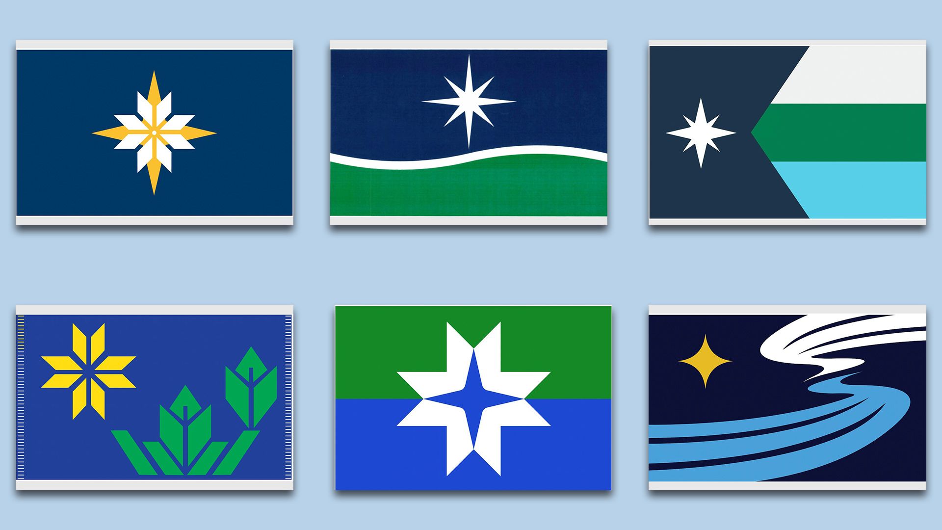
Personally, I don't love any of the six finalists. The blue and green color scheme on so many feels too muted for a flag. It doesn't stand out enough. I'm also a little wary of having the flag be too literal — "here's the grass, here's the lake, here's the sky, etc."
A lot of people seem to like the starflake design, and that's probably the sharpest of the finalists. But there's too much empty space around the flake. The design either needs a circle or a more unique design for the flake, IMO.
Among the others, even though I said I didn't love the literal options, I actually kind of lean toward the fourth one, with the river, cloud and sky. It feels more distinctive than the others.
There were also quite a few interesting designs that didn't make the final cut.
Personally, I kind of like the ones with a light blue base color, such as this one:
Or, going back to the blue and green scheme, I actually really like this one. The giant M is kind of goofy, but it also makes sense and is distinctive. Plus, the light blue breaks up the blue and green much better than any of the finalists. The more I look at this one, the more I think it might have been the best option.

Re: Minnesota State Flag and Seal Redeisgn
Posted: November 22nd, 2023, 12:08 pm
by Anondson
I’m most pleased with the flag that hints at the shape of the state. Though I’d go for taking that flag and sub in the yellow+white starflake instead of the white 8-point star. Even as is, it feels like this could have been a flag that stands the test of time and fits in among an array of flags.
Do not like the swooping lines flag.
In general it feels like 2023 graphic design trends are strong in the vibes of most of these finalists.
Re: Minnesota State Flag and Seal Redeisgn
Posted: November 22nd, 2023, 6:58 pm
by Minnehahaha
Referring to Didier's image of the six finalists, my favorite by far is the top left, and I wouldn't mind the top center or bottom right, but the others?
The top right looks like it might be the flag for some small African nation that I can't quite remember. If the shape on the left is supposed to symbolize Minnesota, it's a stretch. Lower left I just don't get (buds, growth... something?) The lower center image would make a wonderful logo for a medical device company. Or maybe a credit union.
Re: Minnesota State Flag and Seal Redeisgn
Posted: November 23rd, 2023, 3:22 am
by nBode
In my opinion, identification should be the primary function of a flag. It should be clear and simple for the general public to see the flag and think "Minnesota". Representation is important in general but should be a secondary objective at most regarding flag design. The purpose shouldn't be for someone to see the flag and think "Oh, it looks like Minnesota has... some lakes, and stars, and loons, and etc. etc." Spain's flag is recognizable not because anybody has ever actually looked at and interpreted the intricacies of the coat of arms on it, but because it's: red and yellow and has some sort of thing on it. Japan's flag is white with a red circle in the middle. The "Why" is not so important.
Between the two, I think the simplicity of Top Left works well. Just two basic symbols: the north star and a snowflake. I think that combination is quite sufficient to identify Minnesota. I've been a fan since I first saw it last year. I do see how there could be more done with the surrounding space. I think Anondson's suggestion of combining it with Top Right could still work, but it becomes a bit busy.
Re: Minnesota State Flag and Seal Redeisgn
Posted: November 23rd, 2023, 9:13 am
by Nick
It’s gotta be the snowflake.
Re: Minnesota State Flag and Seal Redeisgn
Posted: November 23rd, 2023, 10:25 am
by thespeedmccool
Of those six, top left, top right, and bottom right are the only acceptable ones, and top left is strongly preferred.
Re: Minnesota State Flag and Seal Redeisgn
Posted: November 23rd, 2023, 10:32 am
by VacantLuxuries
In my opinion, identification should be the primary function of a flag. It should be clear and simple for the general public to see the flag and think "Minnesota". Representation is important in general but should be a secondary objective at most regarding flag design. The purpose shouldn't be for someone to see the flag and think "Oh, it looks like Minnesota has... some lakes, and stars, and loons, and etc. etc." Spain's flag is recognizable not because anybody has ever actually looked at and interpreted the intricacies of the coat of arms on it, but because it's: red and yellow and has some sort of thing on it. Japan's flag is white with a red circle in the middle. The "Why" is not so important.
I think this is a result of having a seal for our state flag for 200 years, we have always had a flag that was worst practices for flag design, and people are stuck in that mindset even with an opportunity to fix it.
Which is why it's so disappointing that the
seal designs are clearly just flag designs that have been copy/pasted into a circle shape with obligatory text. The seal is exactly the place to do that sort of thing, as seals historically were complex to avoid forgery. And the one with the loon, which is a modern interpretation of a state seal, unfortunately looks a bit too close to the MN State Lottery logo for me to expect it to win.
Re: Minnesota State Flag and Seal Redeisgn
Posted: November 23rd, 2023, 9:44 pm
by Korh
i might go with the snowflake but I would of changed the yellow star to a cross since iirc MN has the most Scandinavian heritage/decedents out of any state in the US and for better or worse they where as important in the development of the state as the native tribes (actually had a random argument with someone recently whether or not "uffda" was a uniquely MN phrase or not) and the Nordic cross flags are some of the simplest and most recognizable flags out there imo.
Although now I'm curious if the two major tribes (Ojibwe or Dakota) have a common star or snowflake design they could of used in the center as a nice nod
Re: Minnesota State Flag and Seal Redeisgn
Posted: November 24th, 2023, 10:30 pm
by VacantLuxuries
If that had been the intent behind a flag made 100+ years ago, I think it would be an okay suggestion. But after several waves of different immigrants building the history of Minnesota, singling out Scandinavian heritage as the one to enshrine in the flag for several generations (or ideally in perpetuity if we get it right) wouldn't be the best way to represent the state's present and future.
I don't want a flag that looks backwards, frankly. If the design represents past, present, and future, great. But the latter two are more important IMO.
Re: Minnesota State Flag and Seal Redeisgn
Posted: November 24th, 2023, 11:45 pm
by Korh
eh Agree, although is hard to predict what the present will be remembered for and how the future will play out so its a bit tricky to represent both in a flag. I only mainly suggest the cross design because it's one of the most easiest features to point out and recognize on a flag. Although I don't think it would put Scandinavian heritage over the various other immigrant groups that's built MN because while they are well known for it, there are certainly not the sole proprietors of it, also correct me if I'm wrong but the Fins/Swedes/Norwegians where the 3rd or 4th major immigration wave in the states history so they can't get "we where here """first""" treatment (and at least it would tie into the states history unlike say Hawaii who has the Union Jack because reasons). Arguable the most prevalent thing the group added that's still around to day culturally is the "MN accent" which while isn't as pronounced as some people online like to meme it as, is still noticeable by people outside the state even for those of us who have only lived in the Twin Cities area.
Re: Minnesota State Flag and Seal Redeisgn
Posted: November 25th, 2023, 2:54 pm
by VacantLuxuries
According to Wikipedia and U of M's Minnesota Digital Library sources, the order of the major waves of immigration were -
Germans (1850s-1870s)
Irish (1850s onward)
Scandinavians (1850s-1900s)
Eastern European Jewish Communities (1880s)
Central Europeans (WWI-Great Depression)
Koreans (1950s-1970s)
Hmong/Vietnamese/Lao/Cambodian/Khmer (1970s)
Somali (1990s)
Karen (2000-Today)
And that's just a list of the groups that arrived in a large wave at a given point in history, we are also home to large immigrant communities from Mexico, China, the Philippines, Ethiopia, India, etc.
I think that's why I bristle at the idea of picking a Scandinavian flag, changing the colors, and calling it Minnesotan - they're definitely a part of the cultural makeup of the state, but not to the point that we should be building our entire forward looking identity around that heritage.
Re: Minnesota State Flag and Seal Redeisgn
Posted: November 25th, 2023, 3:30 pm
by Korh
Yeah I can see that reasoning. On another subject do they have the finalists for the seals yet or does that come after? Because I'm actually 50/50 if I want to see a loon on it or not.
Re: Minnesota State Flag and Seal Redesign
Posted: November 25th, 2023, 8:33 pm
by VacantLuxuries
Here are the state seal candidates. They're on the same timeline as the flags; both the current flag and current seal sunset on Jan 1st and so both need to be replaced in December or we'll be without either until a decision is made.
I personally love the loon one, and dislike the seal that's a copy/paste of the North Star flag design.
Re: Minnesota State Flag and Seal Redeisgn
Posted: November 25th, 2023, 9:33 pm
by thespeedmccool
Something interesting that came up in the committee's meeting about the seal was that they're considering different languages for the motto, L'Etoile du Nord, which is currently in French. I bet they'll keep it in French, or maybe make it English ("The Star of the North,") but they discussed native languages too.
They also discussed alternate spellings of "Minnesota," like "Mni Sota," as it's rendered in Dakota. I doubt they'll do anything that crazy (and respelling it on the seal wouldn't mean the name of the state itself was changing,) but I have to admit, it would be really fun to see conservative heads spin over such a small change.
One last note: they discussed getting rid of the date "1858" from the seal. The argument is that Minnesota (or Mni Sota) existed long before 1858, and that that date is only the date of the white government's establishment.
Re: Minnesota State Flag and Seal Redeisgn
Posted: November 25th, 2023, 9:49 pm
by Korh
Alright the loon one is good, was a bit worried that it would be to similar to the state lottery for comfort (and I think I remember someone the reason why none where excepted for the flag is because they really only nest in north and central MN so a good chunk of that state have never seen them in the wild)
Re: Minnesota State Flag and Seal Redeisgn
Posted: November 25th, 2023, 10:48 pm
by Silophant
My concern with the loon design isn't so much the similarity to the state lottery logo (that's also a state agency, so whatever) but the similarity to the privately owned MNUFC logo.
Re: Minnesota State Flag and Seal Redeisgn
Posted: December 5th, 2023, 11:21 am
by Silophant
Re: Minnesota State Flag and Seal Redeisgn
Posted: December 6th, 2023, 11:33 am
by BigIdeasGuy
I love the loon, my concern is that it will look dated in 15 years and we will all collective ask ourselves what were we thinking. It doesn't have a timelessness to it IMO